YI Technology Email Marketing Redesign
Increasing Conversion Rates Through Strategic UI Design
Role: Digital Designer
Timeline: 1 month
Team: Marketing team
Tools: Adobe Creative Suite, Klaviyo, Shopify

THE PROBLEM
YI Technology's email marketing campaigns were suffering from poor performance metrics and low conversion rates. Through analysis of their existing email templates, several critical design issues were identified.
Key Issues:
Cognitive Overload: Single emails attempted to communicate multiple messages simultaneously (promotions, product news, educational content, support information)
Weak Visual Hierarchy: No clear focal points or primary call-to-actions
Inconsistent Brand Identity: Emails lacked cohesive visual styling and brand consistency
Poor Mobile Experience: Templates weren't optimized for mobile viewing
Unclear Value Proposition: Key offers and benefits were buried within cluttered layouts
Impact:
Poor click-through rates (1.2%)
Minimal revenue attribution from email campaigns
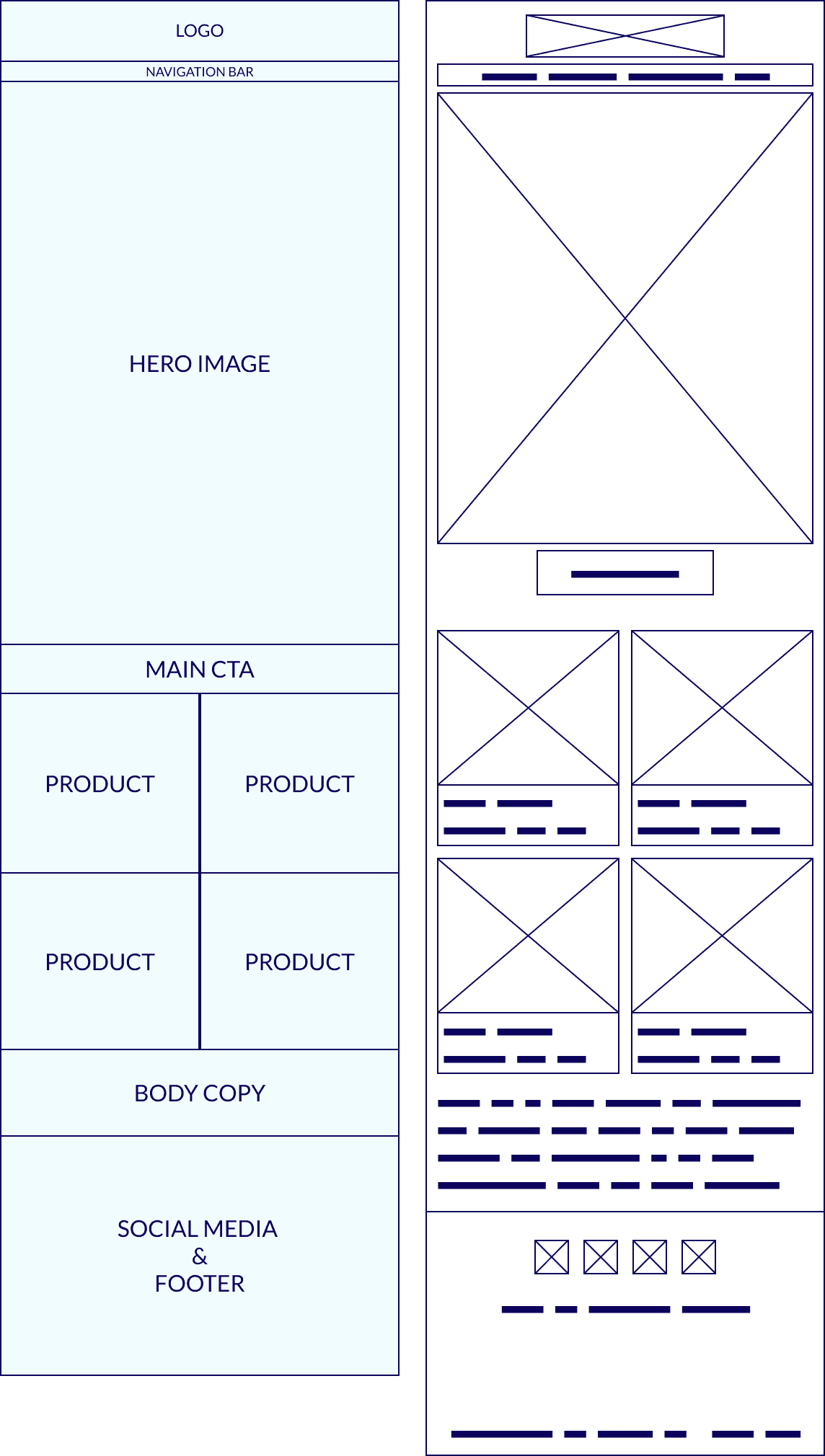
WIREFRAMING & PROTOTYPING
Before diving into visual design, I established a systematic wireframing process to solve the core structural issues plaguing YI Technology's email campaigns. The wireframing phase was crucial for defining content hierarchy, establishing clear user flows, and ensuring every element served a specific conversion purpose.
Design Rationale: This structure prioritized visual hierarchy through spatial relationships rather than visual styling.
The large hero section ensures immediate message clarity, while the product grid provides organized choice architecture without overwhelming the user.
The single primary CTA placement follows the principle of decision reduction - users encounter one clear action after understanding the value proposition.
Spatial Relationship Mapping: The wireframes established consistent spacing relationships that would translate across different screen sizes.
Hero sections claimed 40-50% of above-the-fold space
Product grids maintained consistent aspect ratios
CTA buttons received adequate surrounding white space for prominence
These wireframes became the template system for YI Technology's ongoing email marketing efforts, providing:
Consistent User Experience: Standardized layout expectations across all campaigns
Rapid Campaign Development: Pre-validated structure reducing design iteration time
A/B Testing Foundation: Controlled variables for testing content and messaging while maintaining proven structural elements
Cross-Team Alignment: Clear visual reference for marketing, development, and stakeholder reviews

Visual Design System Implementation:
With validated wireframe structures in place, the high-fidelity design phase focused on translating strategic layouts into visually compelling, brand-consistent templates that would drive measurable engagement and conversions. This phase required balancing aesthetic appeal with technical constraints while maintaining the conversion-focused architecture established during wireframing.
Strategic color application played a crucial role in conversion optimization. YI Technology's signature red was strategically applied to CTAs and urgent messaging elements, while professional blue tones built trust and security associations appropriate for technology products. All color combinations maintained high contrast ratios of 4.5:1 minimum to ensure accessibility compliance, and generous white space utilization created a premium brand perception while improving content scanability. Seasonal and thematic adaptations allowed for contextual color schemes, such as patriotic themes for July 4th campaigns and warm tones for Father's Day promotions, without compromising core brand identity.
Klaviyo Integration and Automation Optimization:
Following the successful email redesign, we expanded into Klaviyo automation optimization, integrating directly with YI Technology's Shopify store. This evolution transformed static campaigns into dynamic, behavior-driven email marketing systems.
The new templates were adapted into sophisticated automated sequences including welcome series, abandoned cart recovery, post-purchase follow-ups, and win-back campaigns. Each sequence maintained the high-converting design framework while targeting specific customer behaviors and lifecycle stages. Advanced segmentation allowed template variations based on purchase history, engagement levels, and customer demographics.
Dynamic content implementation allowed product recommendation engines to populate email templates with personalized suggestions while maintaining design consistency. Personalized pricing displays adjusted based on customer segments, inventory-based urgency messaging adapted to stock levels, and seasonal template variations automatically triggered based on calendar events and inventory cycles.
The Shopify store integration created seamless conversion funnels that maintained visual and messaging consistency from email engagement through purchase completion.
After implementing the design changes and optimizing Klaviyo's email automation the email marketing campaigns saw a 400% increase in conversions, leading to an average monthly revenue of over $20,000 USD. Key performance indicators significantly improved, with the open rate increasing to 24% and the click-through rate rising to 2.2% (a substantial jump from the previous 1.2%).
We continued to optimize and improve the email campaigns using heatmap data and sales date from Shopify. Eventually we reached a point where 50% of the revenue generated came from email automation.
