
Neokyo new user page
Role: UX/UI Designer
Length: 2 weeks
Tools: Figma, Hotjar, Google Analytics

The challenge
Neokyo is a Japanese proxy shopping service, which by default introduces more complexity compared to traditional e-commerce platforms.
Users need to navigate various steps such as item searches, order consolidation, and international shipping logistics. However, the existing introduction page made it difficult for new users to understand these processes, leading to frequent questions for the support and moderation teams.
Essential information was either hard to find or too complicated for users to quickly grasp, resulting in a frustrating onboarding experience.
Specific goals
・Simplify the information architecture to make key details more intuitive and easier to locate.
・Make content more concise and digestible to improve user comprehension and reduce feeling overwhelmed.
・Create multiple exit points on the page, allowing users to seamlessly begin their journey or dive deeper into specific features of the platform.
Design process
My task was to design a new introductory experience to help explain what a proxy service is, how it works, and how Neokyo stands out compared to competitors. I began with the assumption that users were arriving with next to no knowledge and wanted to figure out why people were recommending our service.
The design framework I followed validated this assumption through reviewing previous user research, then shaped the solution through refining the page’s information architecture and modernizing the experience.

Common questions and queries from new users
I started by reviewing and analyzing customer tickets and messages from our community Discord to see if I could identify any common pain points. Both channels showed a large number of new users asking basic questions related to the service and were often referred to the existing new user guide or to other specific pages explaining in more detail. I managed to organize the majority of these questions into the following 3 categories:
How to
“How do I make a buy request for {Insert store}?”
“How can I find out what I’m allowed to purchase?”
“How can I cancel my package request?”
“How can you find more information about {topic}?”
How much
“How much does the service cost?”
“Is the fee per item?”
“How much is domestic shipping?”
”How much does it cost to create a package?”
“How much can I save if I combine orders into one package?”
Where can
“Where can I purchase items from?”
“Where can I see what items aren’t allowed to be shipped?”
“Where can I see how long until my order arrives?”
”Where do I pay for my auction items?”
Reviewing data from Hotjar
I wanted to see how these users interact with the new user guide page, so I reviewed sessions recordings and heatmaps available on Hotjar. From sessions recordings, I could see that the current experience was not mobile friendly and led to users rapidly scrolling up and down the page, trying to find relevant information.
Additionally, users who did find what they were looking for would have to click into 1 or 2 more pages to get additional information. However, the bounce rate of this page is higher than the majority of Neokyo’s other pages and a marginally higher amount of recordings flagged with the user frustration marker/rage clicks.
This led me to believe that users were frustrated that they couldn’t easily and quickly locate the information for their specific concerns.
Page performance:
Bounce rate: 14%
Most clicked link: Fee’s page
Users who reach bottom of page: 5%
Additional findings:
There is a high amount of clicks / engagement on elements that are not interactable.
Problems with the previous page
After reading customer feedback, reviewing the page, and analyzing data from Hotjar and Google Analytics, I identified three key pain points with the previous experience:
Lack of Meaningful Information: The page did not offer any substantial information and instead provided links to other pages with large, overwhelming blocks of text. This approach bored and frustrated users.
Single-Column Layout: The single-column layout resulted in very long scrolling, causing users to bounce before finding the information they needed.
Poor Information Architecture: While the page offered many links, it was unclear what information was covered and if it was relevant to the user's specific questions. This could lead to users getting lost in the site's hierarchy.

Mapping out the new page
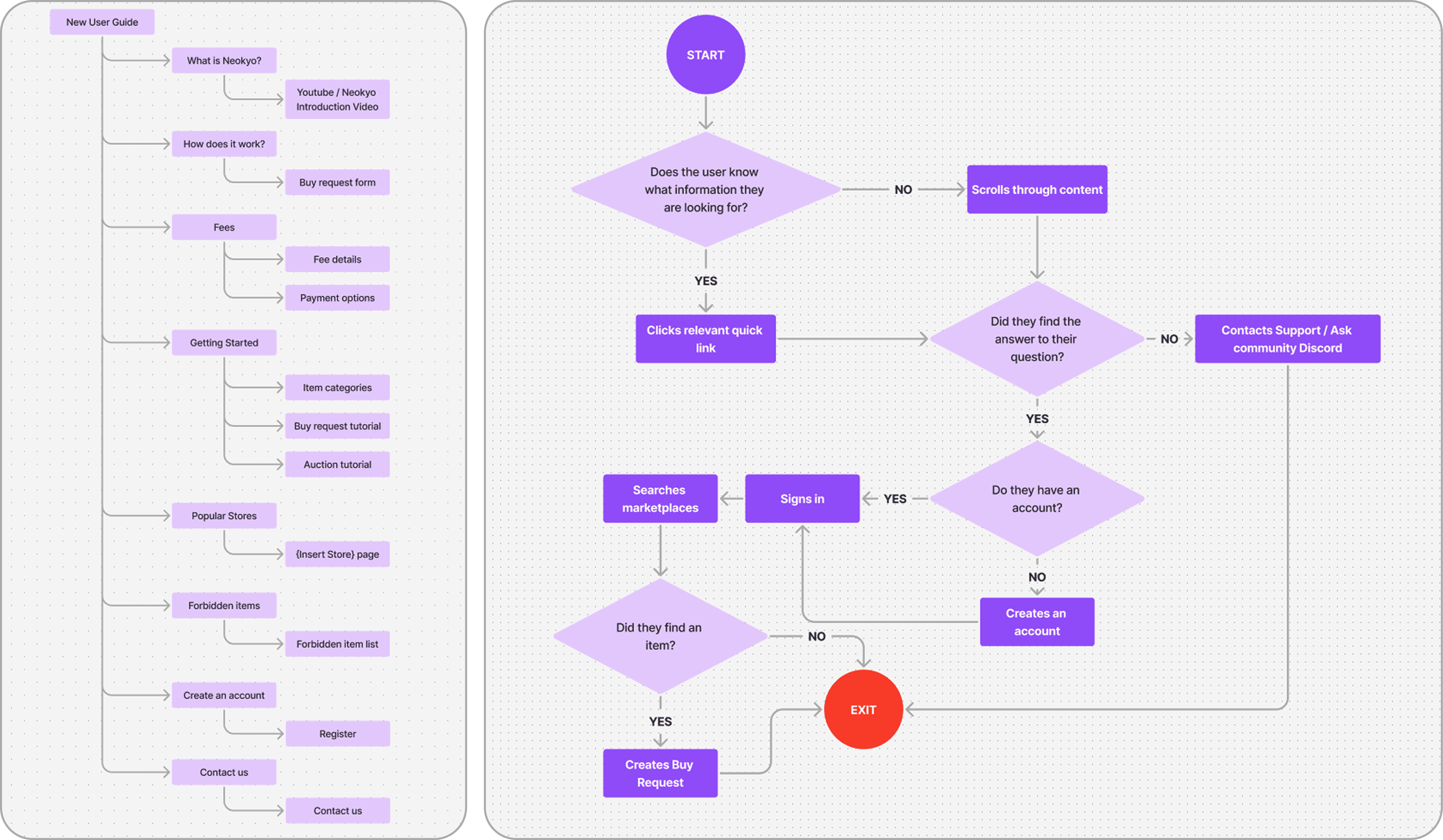
The next step I took was to plan out the pages structure. I took the current page as a base and while discussing with stakeholders decided what new or modified sections could be included.
Afterwards the next step was to create the user flow for the new user guide page and potential next steps for the user.
Sketching and ideating
Once I had a plan outlined, I moved onto sketching and noting down my ideas for different elements on the page. At this point the amount of content blocks for sections such as “Neokyo Steps” were in flux and elements such as the fee breakdown were being experimented with and evaluated.
I used this time to prepare for wireframing and discuss my ideas with relevant team members (such as the frontend developer) to get an idea of what would be the best approach for Neokyo*.
*At the time of this project Neokyo was still using JQuery 3.5 and had strict limitations for UI components.

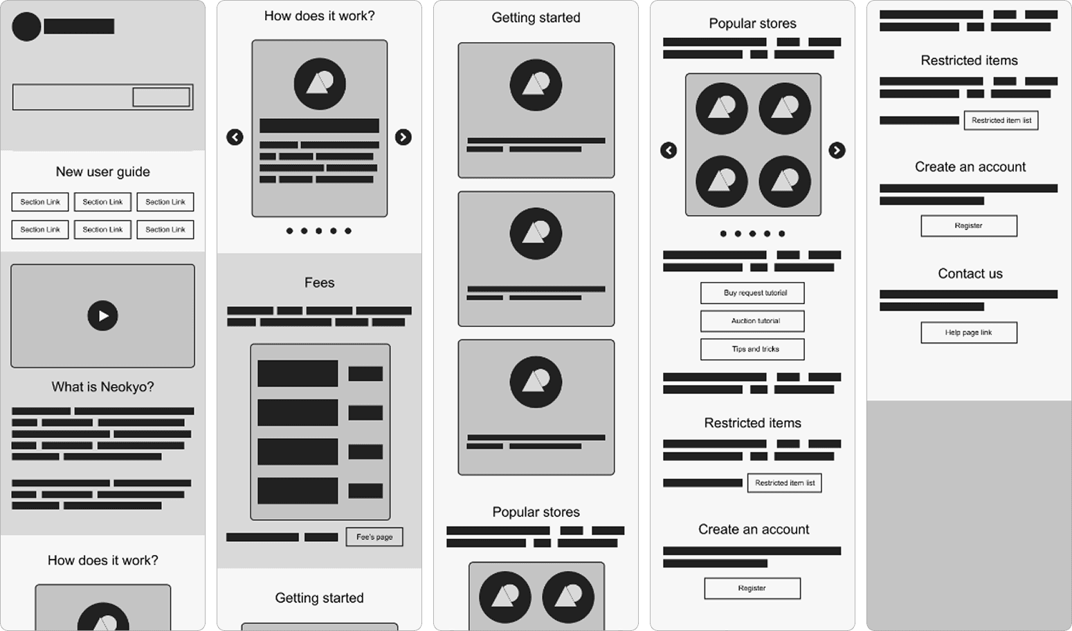
Low-fidelity mockups
My main focus during this stage of the product was considering how to restructure the existing content on the page and how to incorporate new additions. I wanted to focus on making sure elements had enough space to breath and be easily digested by new users to avoid feeling overwhelmed.
Once the low-fidelity mockup was completed, I shared it with key stakeholders and the customer service team to find out what additional elements could be added to the page.
After receiving requests to include a service comparison table and the list of prohibited items.
I move forward with the project and started designing the high-fidelity mock ups.

High-fidelity mockups

Results and next steps
Before pushing the page live for all users to see, we conducted a brief 2 week A/B test to evaluate the performance of the page and identify any issues that may have been missed by internal QA testing.
The initial results seemed positive and after a few minor bug fixes, we completely launched the New User Guide page! We continued monitored the performance and interaction heat maps to see if any further changes or adjustments needed to be made.
Overall performance of this page had improved and we saw an increase in understanding among new users leading to a higher conversion rate and a reduction in common support questions.
The overall experience is now mobile friendly and the use of quick links at the top has proven to be a success that can be implemented in future page update projects.
Page performance:
Bounce rate: 5% (Previously 14%)
Most clicked link: Fee’s page
Users who reach bottom of page: 25%
Noticeable reduction education of incoming questions related to Fees, Prohibited items, and buy requests
Increased number of new users converting to purchasing users
Return to portfolio
Neokyo new user page
Role:
UX/UI Designer
Length:
2 weeks
Tools:
Figma, Hotjar, Google Analytics
The challenge
Neokyo is a Japanese proxy shopping service, which by default introduces more complexity compared to traditional e-commerce platforms.
Users need to navigate various steps such as item searches, order consolidation, and international shipping logistics. However, the existing introduction page made it difficult for new users to understand these processes, leading to frequent questions for the support and moderation teams.
Essential information was either hard to find or too complicated for users to quickly grasp, resulting in a frustrating onboarding experience.
Specific goals
・Simplify the information architecture to make key details more intuitive and easier to locate.
・Make content more concise and digestible to improve user comprehension and reduce feeling overwhelmed.
・Create multiple exit points on the page, allowing users to seamlessly begin their journey or dive deeper into specific features of the platform.
Design process
My task was to design a new introductory experience to help explain what a proxy service is, how it works, and how Neokyo stands out compared to competitors. I began with the assumption that users were arriving with next to no knowledge and wanted to figure out why people were recommending our service.
The design framework I followed validated this assumption through reviewing previous user research, then shaped the solution through refining the page’s information architecture and modernizing the experience.
Results and next steps
Before pushing the page live for all users to see, we conducted a brief 2 week A/B test to evaluate the performance of the page and identify any issues that may have been missed by internal QA testing.
The initial results seemed positive and after a few minor bug fixes, we completely launched the New User Guide page! We continued monitored the performance and interaction heat maps to see if any further changes or adjustments needed to be made.
Overall performance of this page had improved and we saw an increase in understanding among new users leading to a higher conversion rate and a reduction in common support questions.
The overall experience is now mobile friendly and the use of quick links at the top has proven to be a success that can be implemented in future page update projects.
Page performance:
Bounce rate: 5% (Previously 14%)
Most clicked link: Fee’s page
Users who reach bottom of page: 25%
Noticeable reduction education of incoming questions related to Fees, Prohibited items, and buy requests
Increased number of new users converting to purchasing users
Reviewing data from Hotjar
I wanted to see how these users interact with the new user guide page, so I reviewed sessions recordings and heatmaps available on Hotjar. From sessions recordings, I could see that the current experience was not mobile friendly and led to users rapidly scrolling up and down the page, trying to find relevant information.
Additionally, users who did find what they were looking for would have to click into 1 or 2 more pages to get additional information. However, the bounce rate of this page is higher than the majority of Neokyo’s other pages and a marginally higher amount of recordings flagged with the user frustration marker/rage clicks.
This led me to believe that users were frustrated that they couldn’t easily and quickly locate the information for their specific concerns.
Page performance:
Bounce rate: 14%
Most clicked link: Fee’s page
Users who reach bottom of page: 5%
Additional findings:
There is a high amount of clicks / engagement on elements that are not interactable.
Mapping out the new page
The next step I took was to plan out the pages structure. I took the current page as a base and while discussing with stakeholders decided what new or modified sections could be included.
Afterwards the next step was to create the user flow for the new user guide page and potential next steps for the user.
Sketching and ideating
Once I had a plan outlined, I moved onto sketching and noting down my ideas for different elements on the page. At this point the amount of content blocks for sections such as “Neokyo Steps” were in flux and elements such as the fee breakdown were being experimented with and evaluated.
I used this time to prepare for wireframing and discuss my ideas with relevant team members (such as the frontend developer) to get an idea of what would be the best approach for Neokyo*.
*At the time of this project Neokyo was still using JQuery 3.5 and had strict limitations for UI components.
High-fidelity mockups
Low-fidelity mockups
My main focus during this stage of the product was considering how to restructure the existing content on the page and how to incorporate new additions. I wanted to focus on making sure elements had enough space to breath and be easily digested by new users to avoid feeling overwhelmed.
Once the low-fidelity mockup was completed, I shared it with key stakeholders and the customer service team to find out what additional elements could be added to the page.
After receiving requests to include a service comparison table and the list of prohibited items.
I move forward with the project and started designing the high-fidelity mock ups.
Problems with the previous page
After reading customer feedback, reviewing the page, and analyzing data from Hotjar and Google Analytics, I identified three key pain points with the previous experience:
Lack of Meaningful Information: The page did not offer any substantial information and instead provided links to other pages with large, overwhelming blocks of text. This approach bored and frustrated users.
Single-Column Layout: The single-column layout resulted in very long scrolling, causing users to bounce before finding the information they needed.
Poor Information Architecture: While the page offered many links, it was unclear what information was covered and if it was relevant to the user's specific questions. This could lead to users getting lost in the site's hierarchy.
Results and next steps
Following a comprehensive analysis of all gathered data, I presented key findings and potential solutions to the relevant project managers. This collaborative discussion resulted in the incorporation of improvements to the Instant Lesson feature within the project roadmap, targeted for completion in Q2 2023.
Shortly after completing this research italki launched the ability for teachers to create group classes. However, these classes mirrored traditional
1-on-1 lessons and have to be booked in advance. The idea of drop-in lessons was not included until the model could be improved for single users first.
I have faith that based off the findings gathered in this research project the team at italki can improve the Instant Lesson feature to make the experience more enjoyable and consistent for students, as well as providing teachers with more tools to reduce attendance based failures.
Return to portfolio