
Neokyo store page redesign
Connecting users with Japanese largest marketplaces
Role: UX/UI Designer
Length: 3 weeks
Tools: Figma, Hotjar, Metabase

The challenge
Neokyo is a Japanese proxy shopping service that partners and promotes Japan's largest marketplaces and online stores to international customers.
However, as a small business and start-up, different freelancers had different ideas of what a store page should look like, leading to an inconsistent and outdated user interface in 2024.
Now that Neokyo has experienced rapid growth and expansion, the company could bring in an in house designer (me) to improve the user experience and consistency of the site. I was tasked with reviewing our current store pages and designing a template that could be easily used on multiple different marketplaces while remaining flexible enough to be adapted for unique situations.
Specific goals
・Create a based template to be used for all future store pages.
・Improve the completion rate of users starting from the store page to confirming their purchase.
・Ensure store pages maintain a consistent appearance and mobile-friendly interface.
Design process
To complete my task, I needed to understand the current state of Neokyo's store pages, how users search using them, and then figure out what functionality is core to the experience that must be included in the template and then which elements can be used to expand upon the design without causing the experience to become inconsistent or complicated.

Problems with existing store pages
The design language, layout, and information architecture across multiple marketplaces varied greatly. Some pages would offer functionality that was useful, but unique to that platform. For example, Minne's popular categories offers the ability to "See All" items in a given category, whereas Rakuma's categories only allow the user to view sub-categories.
Suruga-ya's page offers two sets of categories for the user to view, within very close proximity and is visually very different from the other 2 examples. These problems aren't isolated to only these 3 stores. While reviewing every store page, I found that in total Neokyo had 5 different store page layouts making it confusing to navigate and browse between multiple stores.
This goes against one of Neokyo's core selling points, international customers can effortlessly browse and purchase from multiple Japanese stores and ship their items together. Having a different experience per store, makes users more likely to stick to a single store/marketplace.

Reviewing Hotjar and Metabase
I began by reviewing the heatmaps of some of our largest stores via Hotjar and then proceeded to move on to recordings of new users browsing these pages. Afterwards, I compared purchase rates and drop off rates via Metabase, these rates would be used as a measurement of performance after the new pages went live.
Finally I reviewed our help section on Neokyo's community Discord to see what types of problems new users faced when browsing.
Hotjar findings
・Users would struggle to find items they were looking for.
・Backtracking and high levels of frustration while searching.
・Exiting the site after failing to find useful search results.
Metabase findings
・The average number of stores users purchase from is 1.2, the vast majority of users purchase from 1 specific marketplace.
・Consistent monthly purchases all-year round.
・2.4% conversion rate from search to purchase.
Discord findings
・Users with interest in categories such as Japanese fashion do not know what are popular brands or what keywords would yield the best results.
・A large amount of new users are unsure what stores are the best to use for their interests.
・Users are interested in exploring more stores, but do not know what they offer.
Low-fidelity mockups
The next step I took was to plan out the store page template. After reviewing Hotjar, and looking at our community Discord, I began working out what elements are a must have for each store page.
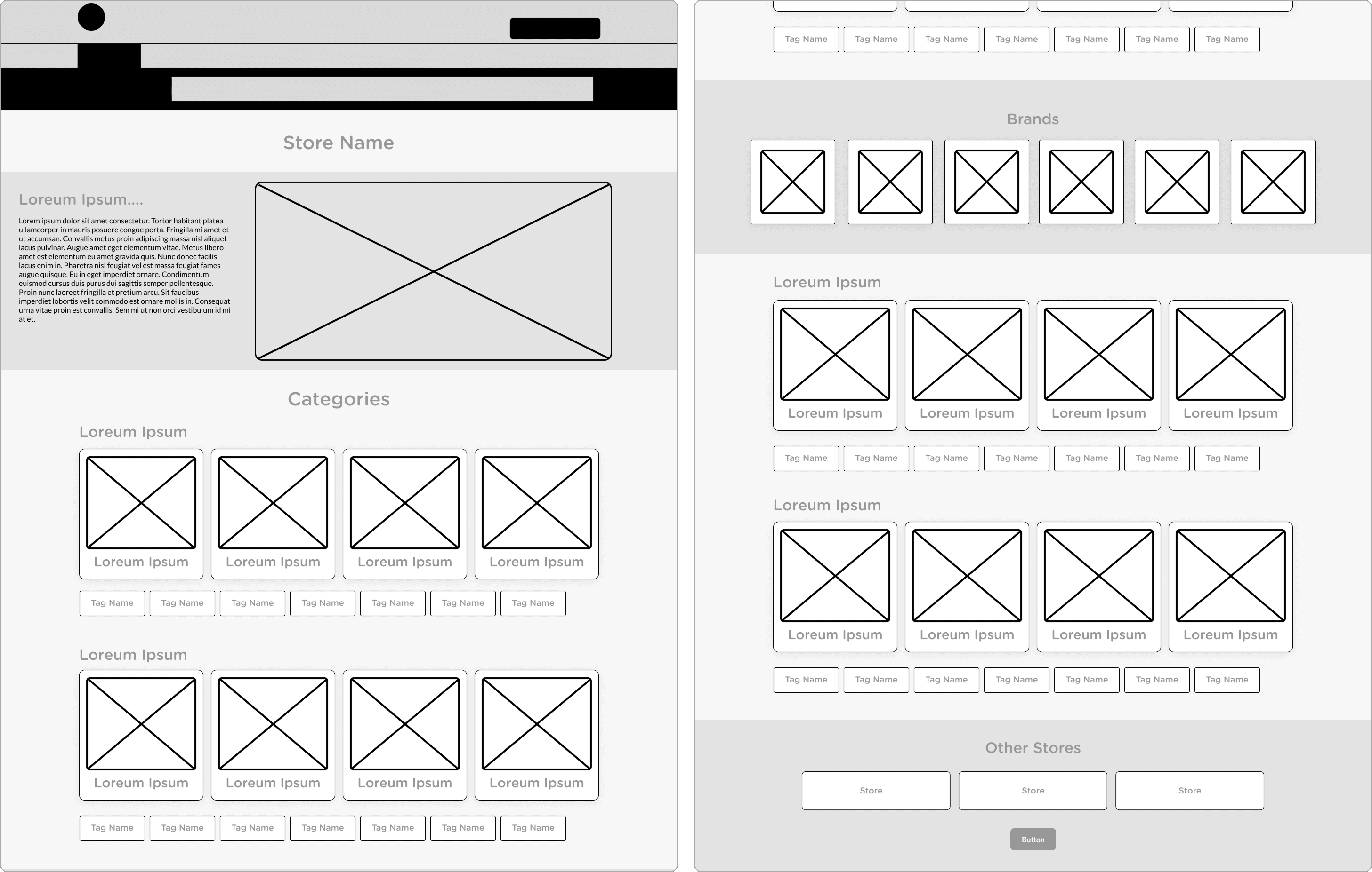

I wanted to present users with a lot more options without causing the page to be too long on mobile. Having the user swipe to scroll through sub-categories allows users to browse categories they are interested in without causing excessive scrolling to discover the category they are interested.
Additionally, to help new users who may be interested in categories such as fashion, music, or figures, I included tags below each category to provide useful suggestions based on popular purchases from other Neokyo users.
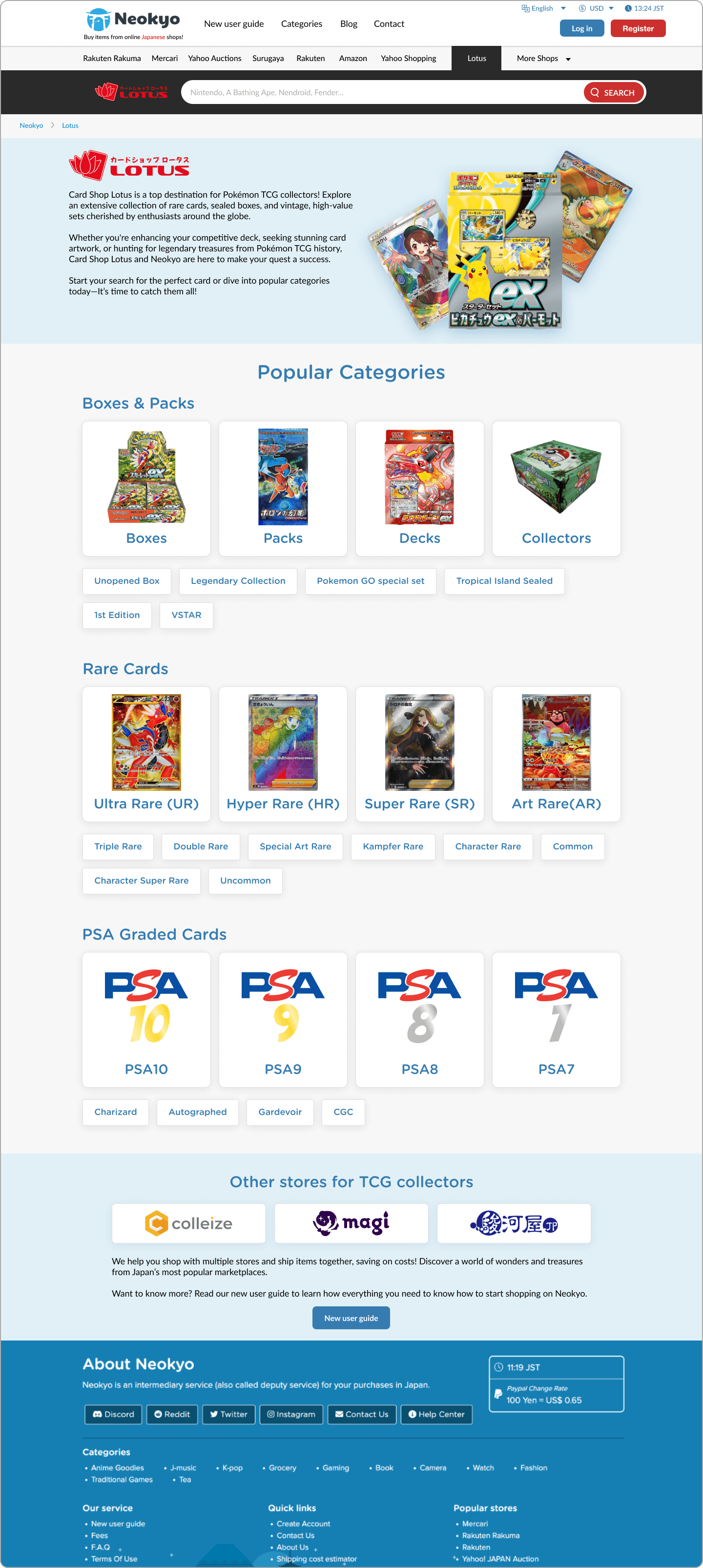
High-fidelity mockups & testing
After discussing the implementation with Neokyo's front-end engineers, I began working on the high-fidelity mock-up. At the time, we were discussing implementing CS Lotus (A Fukuoka-based store) as an official partner store, and it was decided that we should test the new template using this store.
CS Lotus focuses mainly on the sale of trading cards but was easy to implement with the new template. After completing the mock-up, we gave them to a selection of long-term users to gain feedback and suggestions that could be used when implementing the template for other stores.

Implementation and expansion


Results and next steps
After publishing new store pages, Neokyo saw increased purchases from these marketplaces. This rate varies depending on the platform but in the case of Yahoo Fleamarket (JDirectItems Fleamarket), Neokyo experienced an increase of sales of more than 10x.
During the first month of launching the new page, Neokyo experienced more sales from Yahoo Fleamarket than the whole of the year prior.
User feedback from our community discord was positive and helped reinforce my stance on Neokyo's visual direction going forward. After the success of stores such as Yahoo Fleamarket and ZOZOTOWN, we updated our search bar and navigation bar to make landing on these pages even easier.
We will continue to update existing and new stores using this template, as well as, adding additional components to handle the unique behaviors of certain platforms.
Return to portfolio
Neokyo store page redesign
Connecting users with Japanese largest marketplaces
Role:
UX/UI Designer
Length:
3 weeks
Tools:
Figma, Hotjar, Metabase
The challenge
Neokyo is a Japanese proxy shopping service that partners and promotes Japan's largest marketplaces and online stores to international customers.
However, as a small business and start-up, different freelancers had different ideas of what a store page should look like, leading to an inconsistent and outdated user interface in 2024.
Now that Neokyo has experienced rapid growth and expansion, the company could bring in an in house designer (me) to improve the user experience and consistency of the site. I was tasked with reviewing our current store pages and designing a template that could be easily used on multiple different marketplaces while remaining flexible enough to be adapted for unique situations.
Specific goals
・Create a based template to be used for all future store pages.
・Improve the completion rate of users starting from the store page to confirming their purchase.
・Ensure store pages maintain a consistent appearance and mobile-friendly interface.
Design process
To complete my task, I needed to understand the current state of Neokyo's store pages, how users search using them, and then figure out what functionality is core to the experience that must be included in the template and then which elements can be used to expand upon the design without causing the experience to become inconsistent or complicated.
Results and next steps
After publishing new store pages, Neokyo saw increased purchases from these marketplaces. This rate varies depending on the platform but in the case of Yahoo Fleamarket (JDirectItems Fleamarket), Neokyo experienced an increase of sales of more than 10x.
During the first month of launching the new page, Neokyo experienced more sales from Yahoo Fleamarket than the whole of the year prior.
User feedback from our community discord was positive and helped reinforce my stance on Neokyo's visual direction going forward. After the success of stores such as Yahoo Fleamarket and ZOZOTOWN, we updated our search bar and navigation bar to make landing on these pages even easier.
We will continue to update existing and new stores using this template, as well as, adding additional components to handle the unique behaviors of certain platforms.
Low-fidelity mockups
The next step I took was to plan out the store page template. After reviewing Hotjar, and looking at our community Discord, I began working out what elements are a must have for each store page.
I wanted to present users with a lot more options without causing the page to be too long on mobile. Having the user swipe to scroll through sub-categories allows users to browse categories they are interested in without causing excessive scrolling to discover the category they are interested.
Additionally, to help new users who may be interested in categories such as fashion, music, or figures, I included tags below each category to provide useful suggestions based on popular purchases from other Neokyo users.
Implementation and expansion
High-fidelity mockups and testing
After discussing the implementation with Neokyo's front-end engineers, I began working on the high-fidelity mock-up. At the time, we were discussing implementing CS Lotus (A Fukuoka-based store) as an official partner store, and it was decided that we should test the new template using this store.
CS Lotus focuses mainly on the sale of trading cards but was easy to implement with the new template. After completing the mock-up, we gave them to a selection of long-term users to gain feedback and suggestions that could be used when implementing the template for other stores.
Problems with existing store pages
The design language, layout, and information architecture across multiple marketplaces varied greatly. Some pages would offer functionality that was useful, but unique to that platform. For example, Minne's popular categories offers the ability to "See All" items in a given category, whereas Rakuma's categories only allow the user to view sub-categories.
Suruga-ya's page offers two sets of categories for the user to view, within very close proximity and is visually very different from the other 2 examples. These problems aren't isolated to only these 3 stores. While reviewing every store page, I found that in total Neokyo had 5 different store page layouts making it confusing to navigate and browse between multiple stores.
This goes against one of Neokyo's core selling points, international customers can effortlessly browse and purchase from multiple Japanese stores and ship their items together. Having a different experience per store, makes users more likely to stick to a single store/marketplace.
Return to portfolio